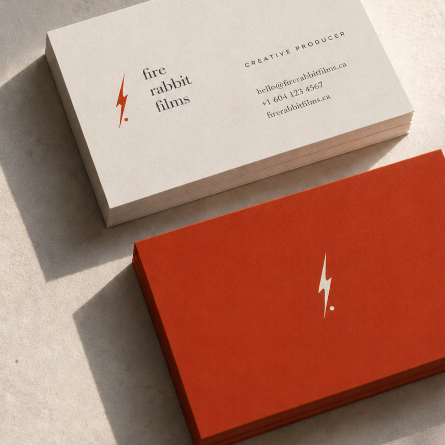
Building a Brand That Leaves Room for the Story
Brand Strategy · Art Direction · Visual Identity · Brand Guidelines
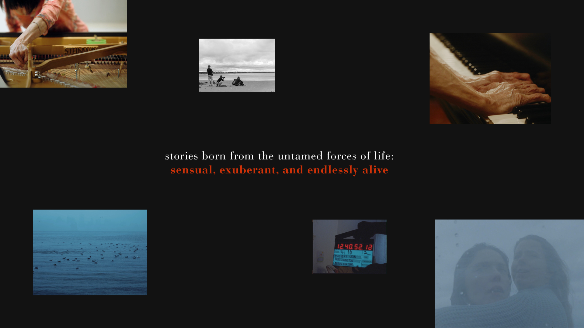
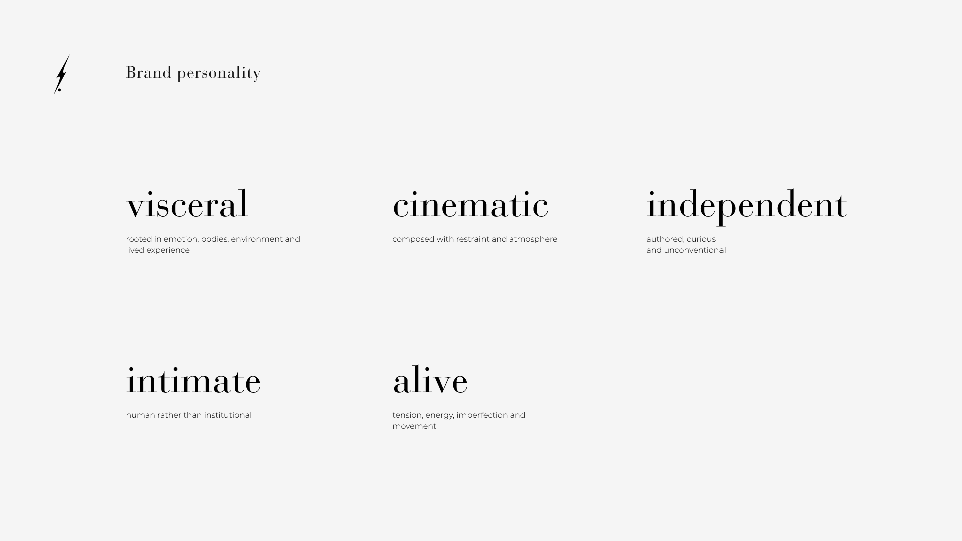
Fire Rabbit Films is an independent production company drawn to stories that feel visceral, intimate and alive. The challenge was to create a distinct identity without imposing one visual language across every filmmaker or story.
I built the system around suggestion, tension and restraint — recognizable enough to belong to Fire Rabbit, but open enough for each film to remain its own world.
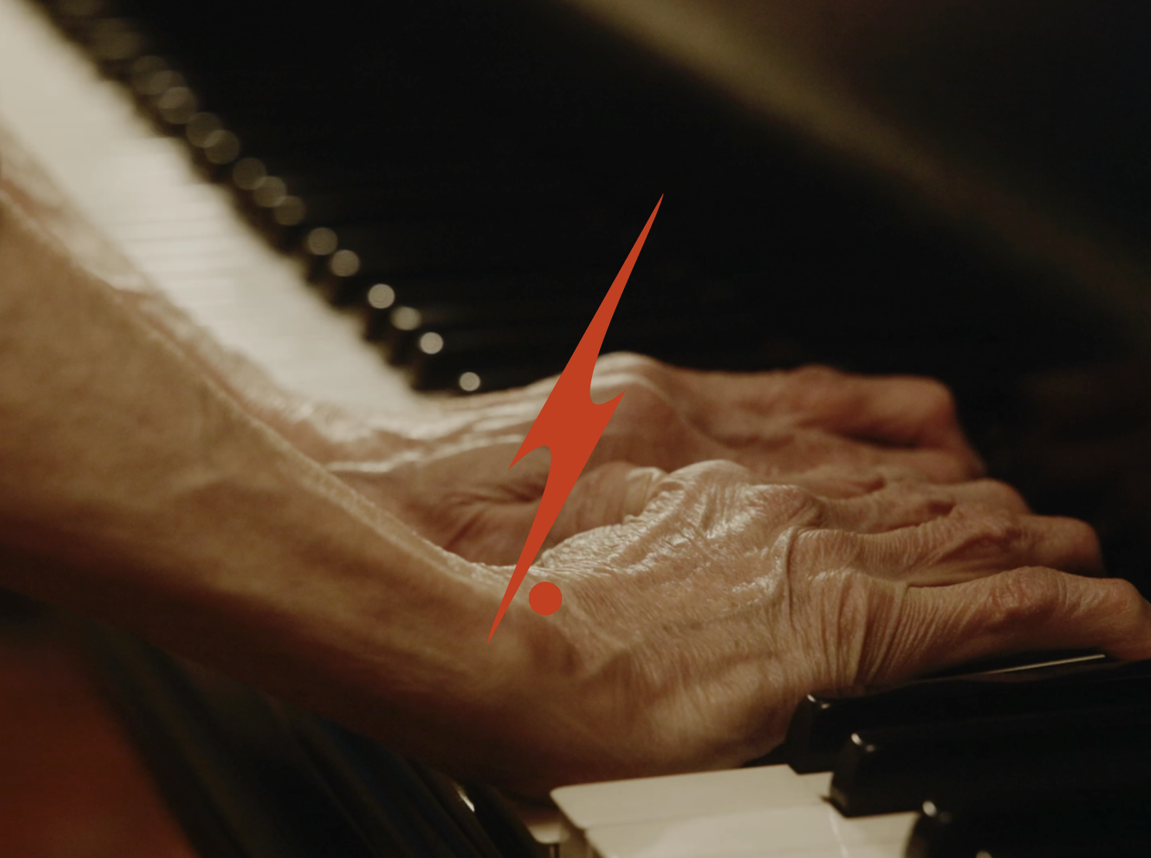
Finding the Brand in the Tension
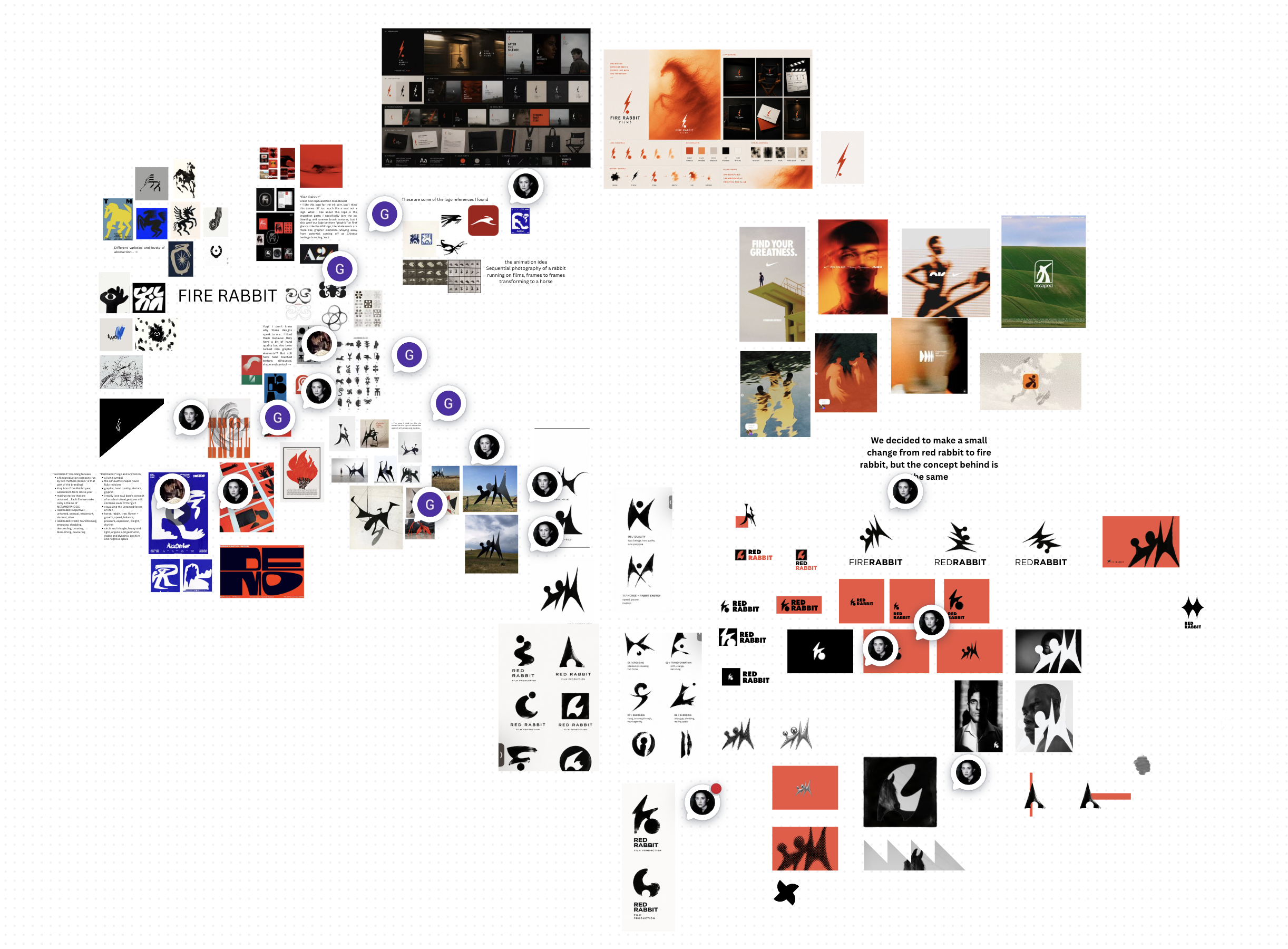
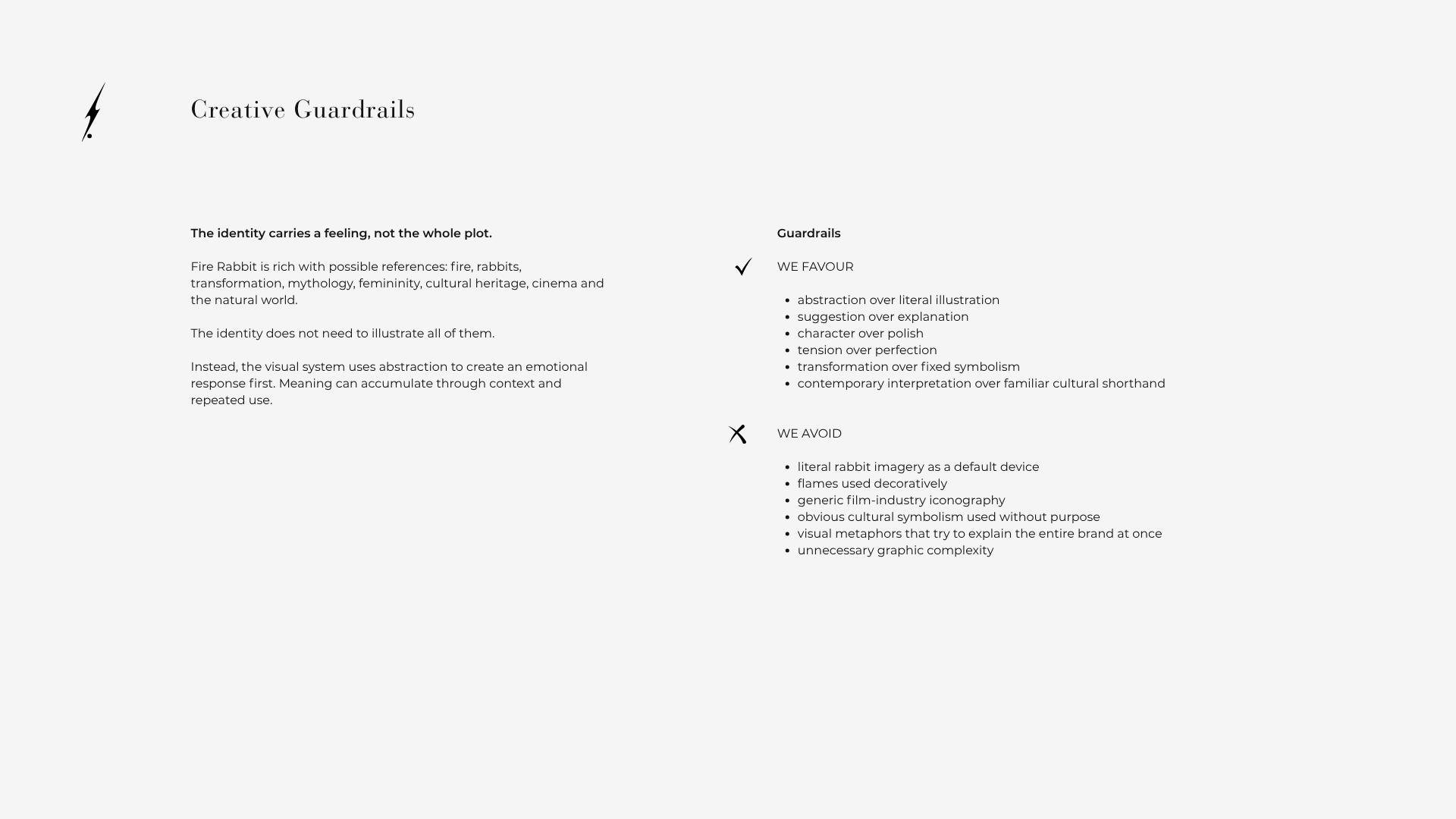
Fire Rabbit came with a rich set of possible references: fire, rabbits, mythology, transformation, femininity, cultural heritage, cinema and the natural world.
Trying to illustrate all of that would have made the identity predictable.
So I established one guiding principle:
The identity carries a feeling, not the whole plot.
The visual system favours abstraction over literal illustration, suggestion over explanation, character over polish and tension over perfection.
A System Designed to Stay Open
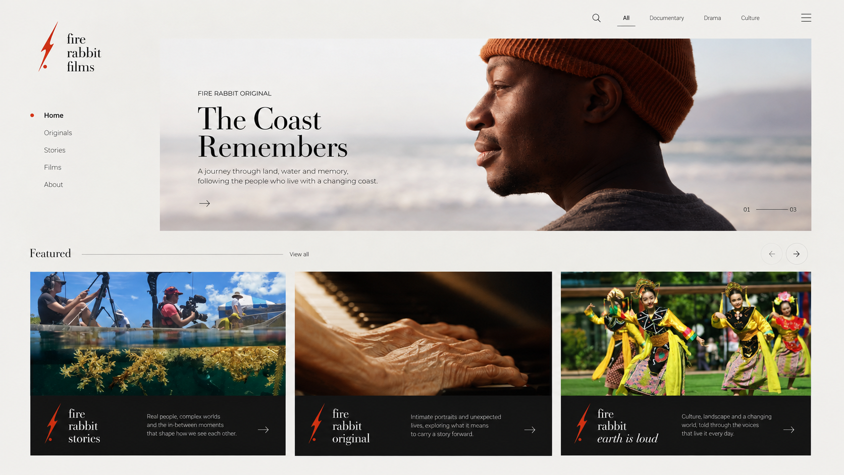
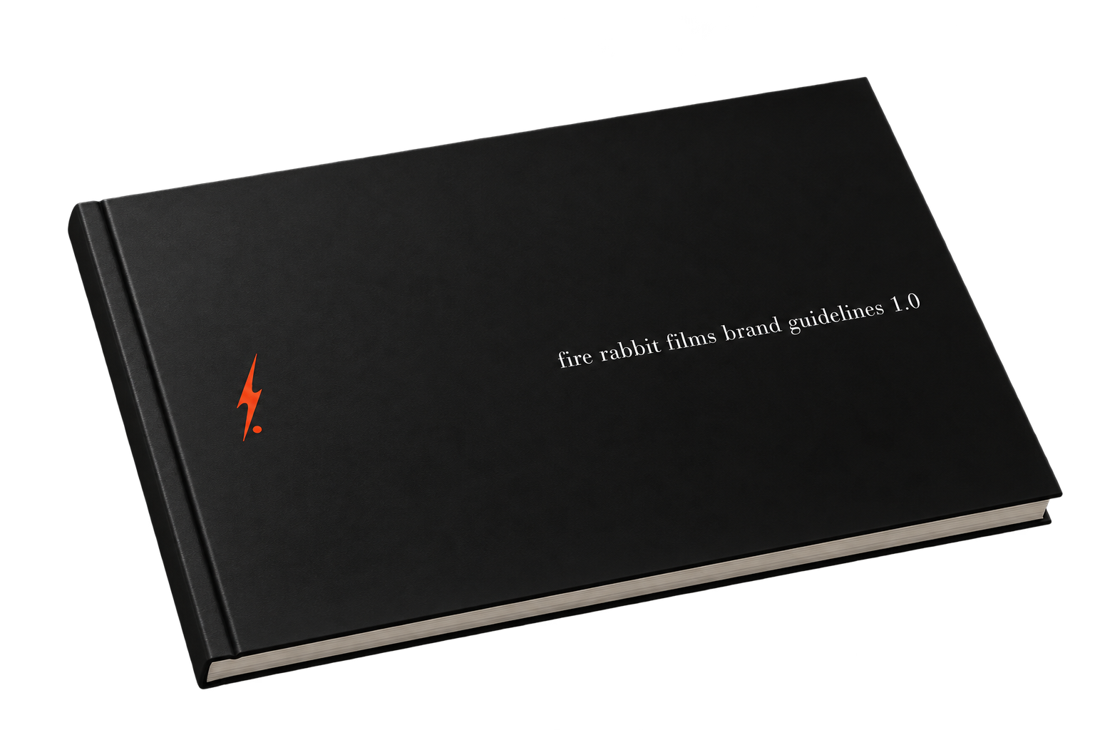
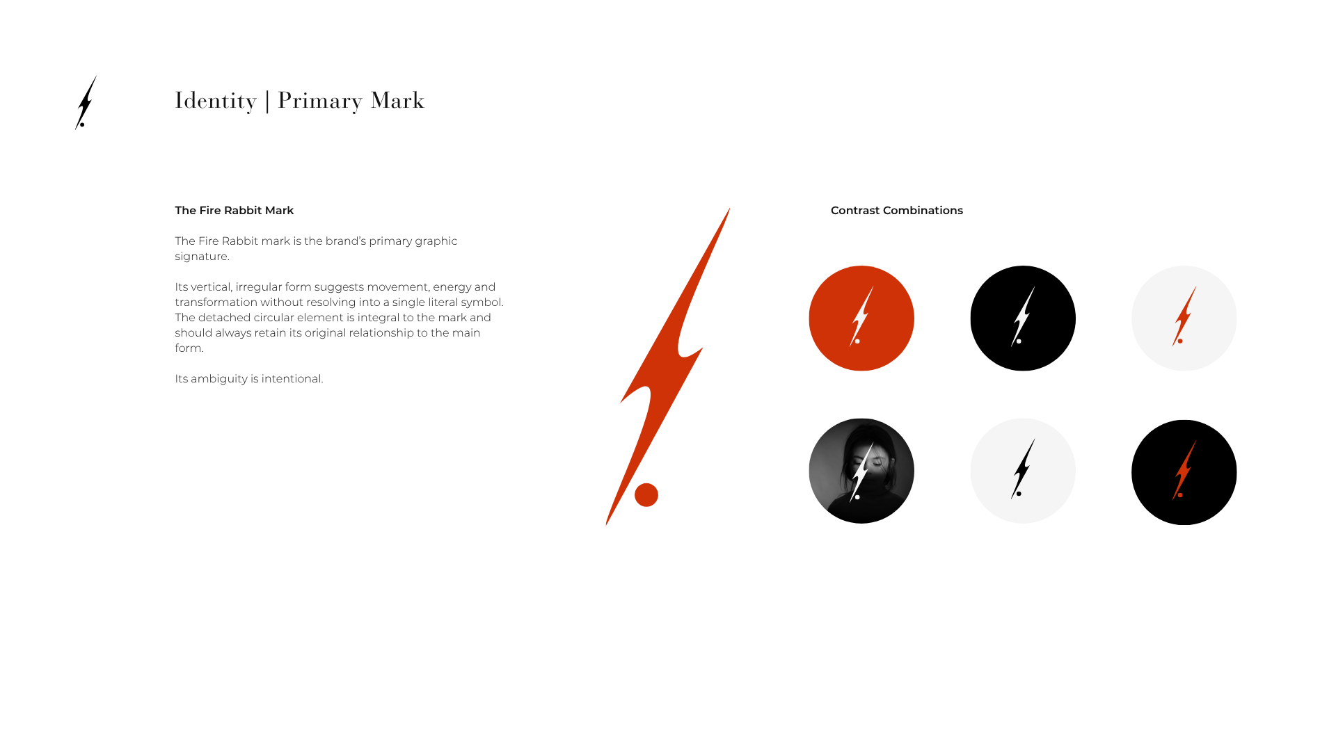
Fire Rabbit’s identity was developed as a flexible system rather than a fixed visual formula.
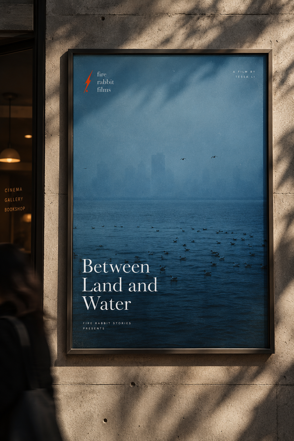
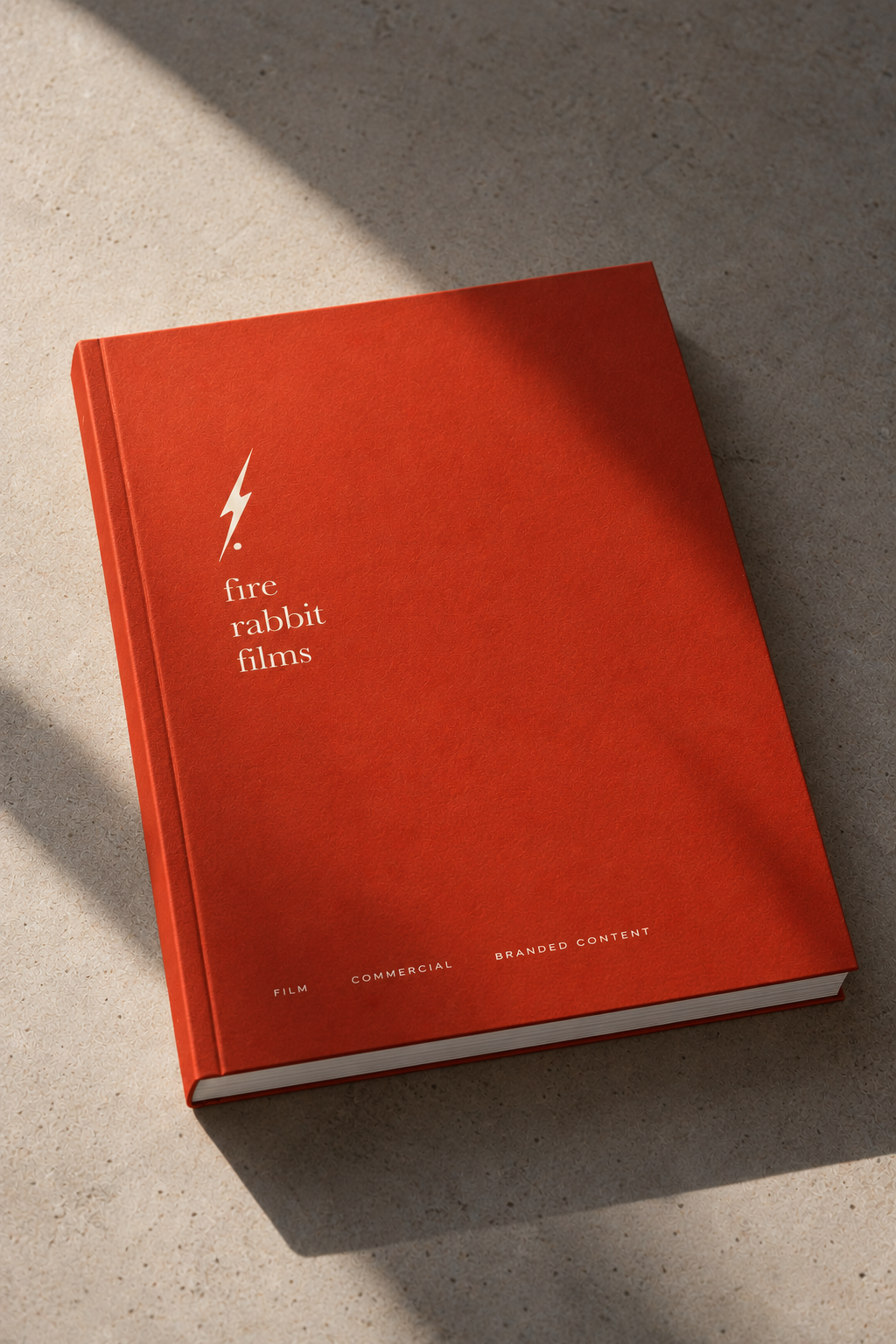
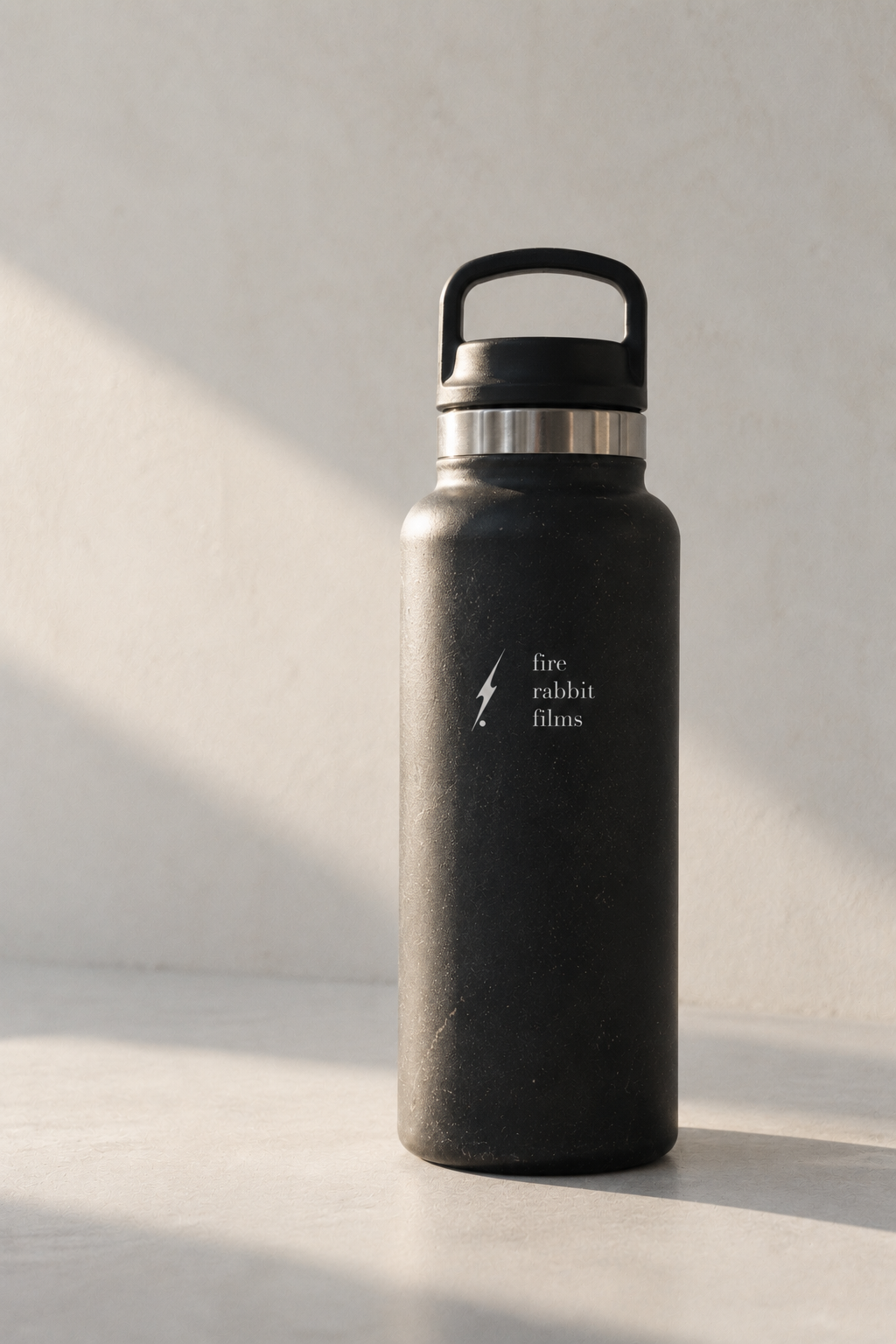
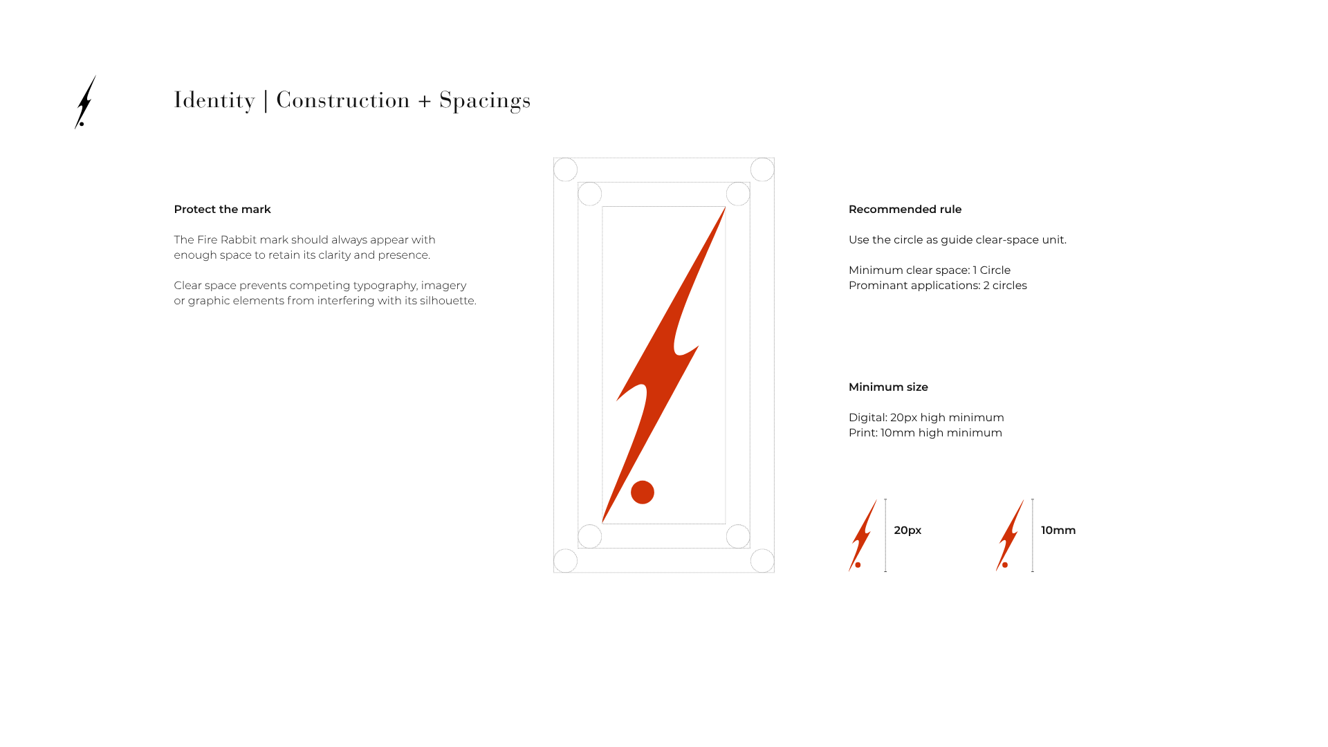
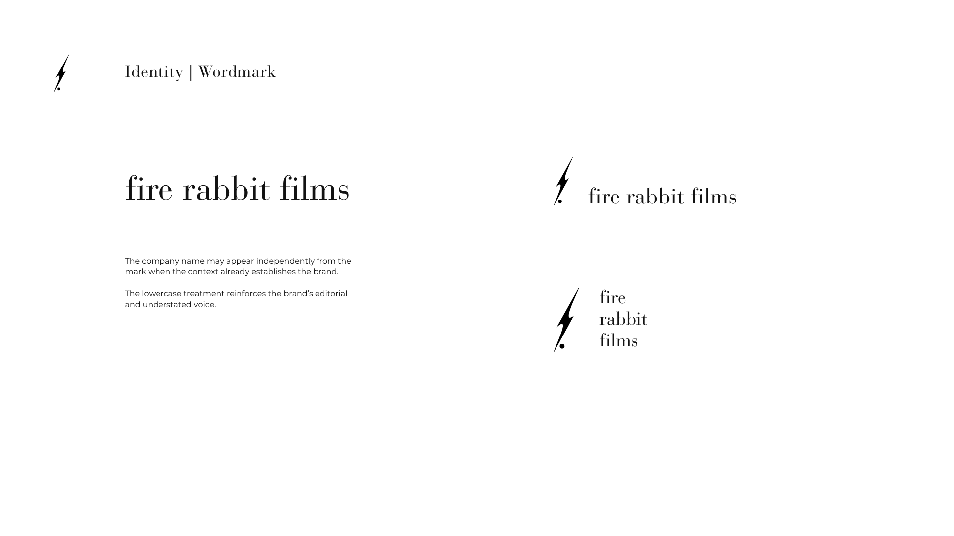
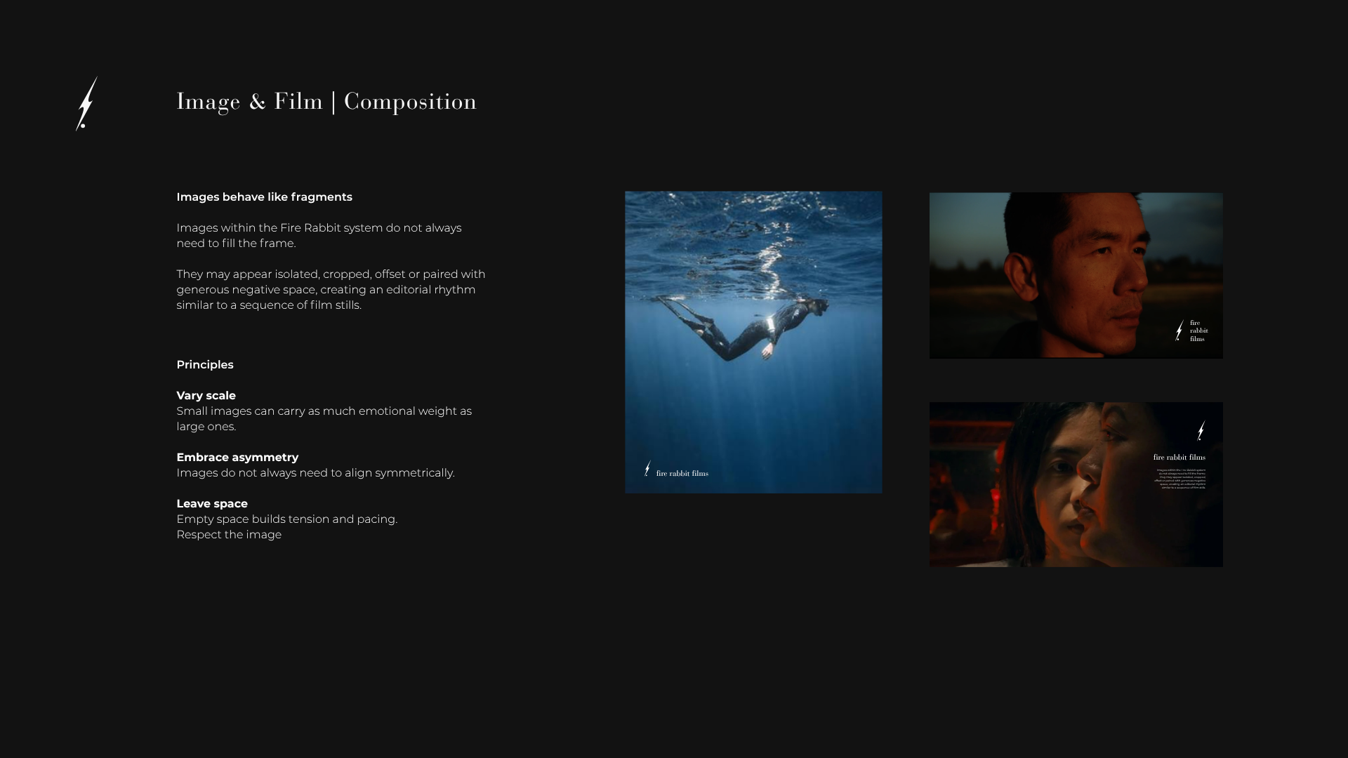
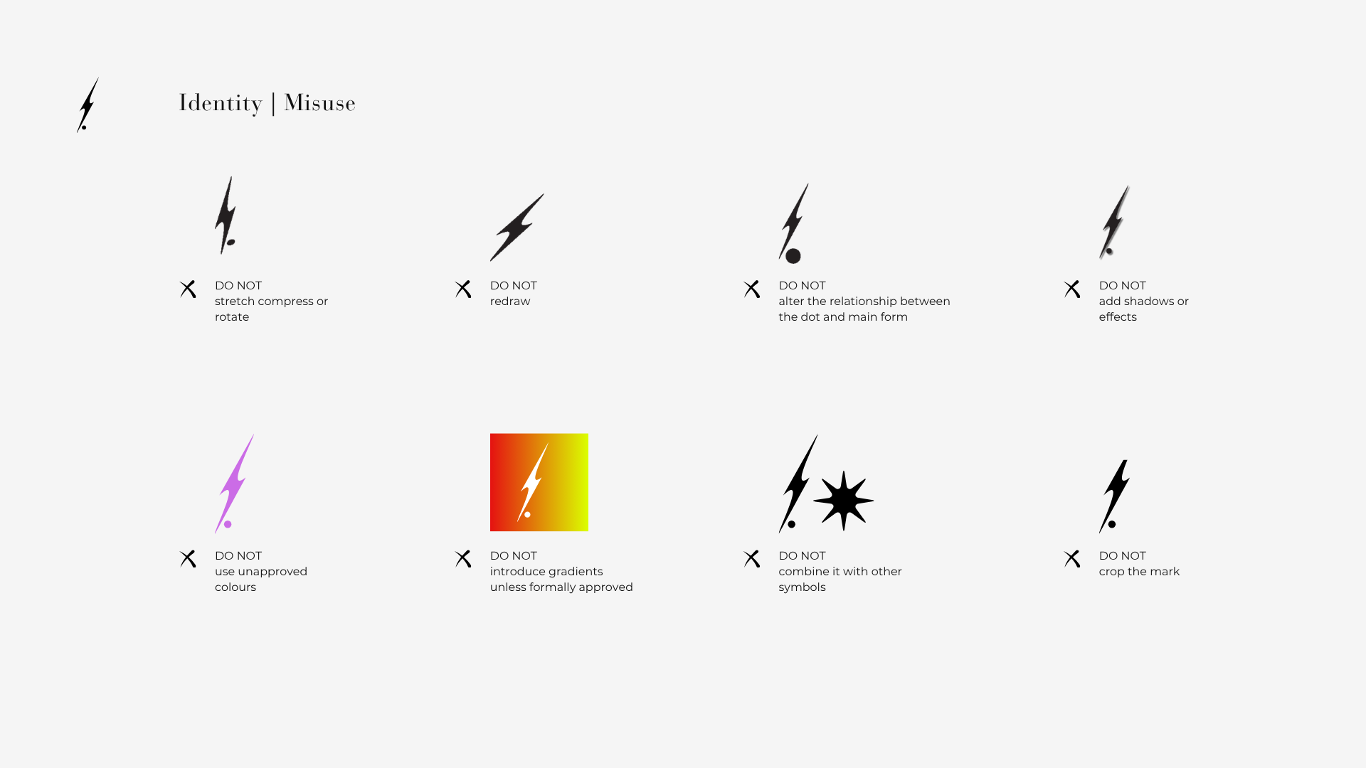
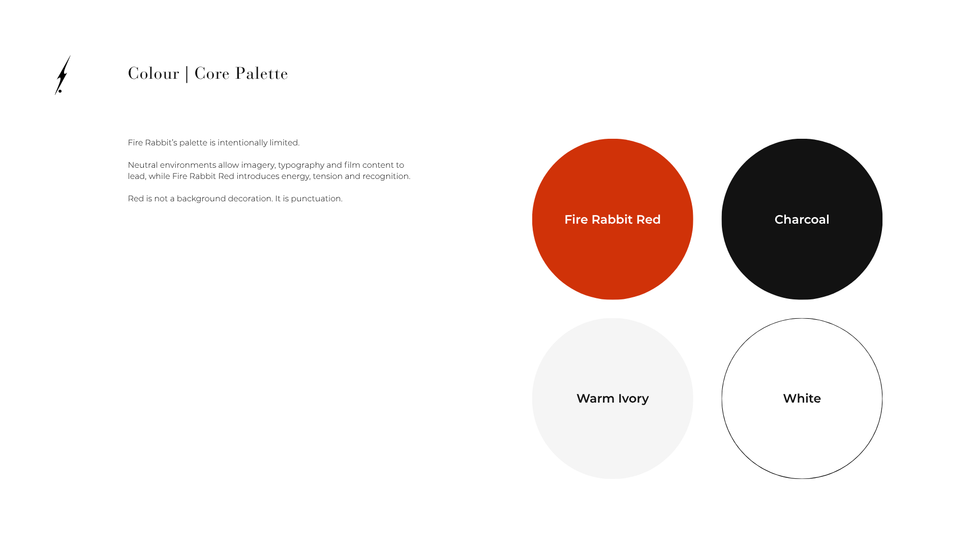
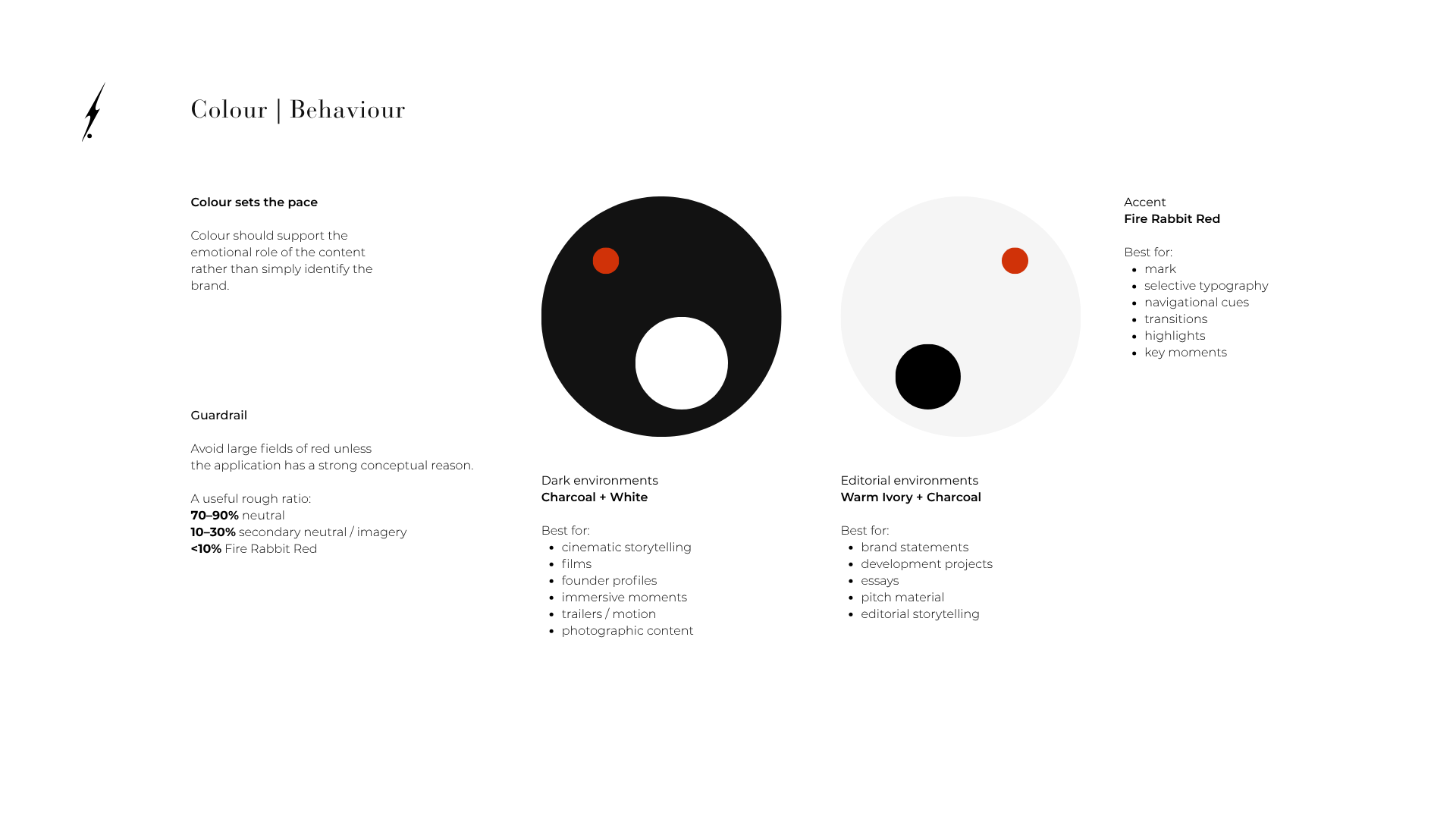
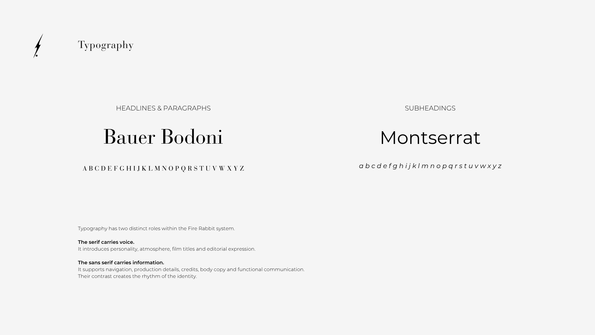
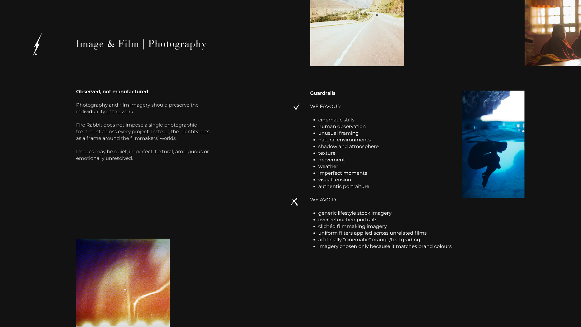
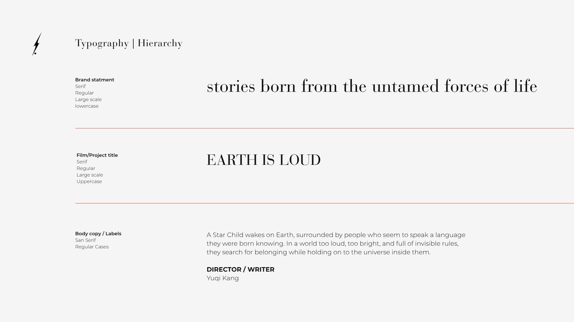
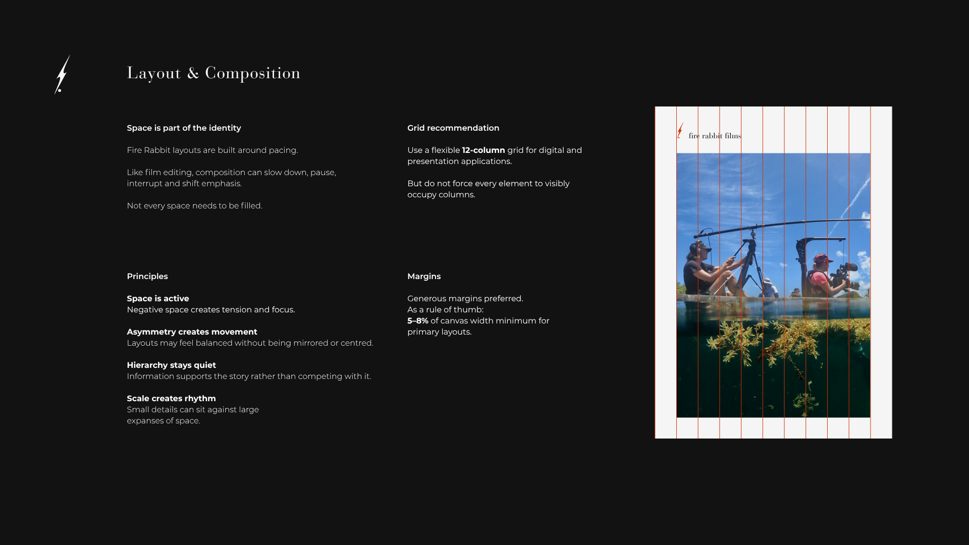
The mark, wordmark, colour, typography, photography and composition work together to create recognition while leaving room for different filmmakers, subjects and visual worlds.
The result is a system that feels consistent without making every piece feel the same.
Consistency Without Sameness
The goal was never to make every Fire Rabbit project look alike. I built a flexible system that creates recognition through a few consistent signals, while allowing each film to keep its own tone, imagery and point of view.
The result is a brand that can hold different stories without flattening them into one aesthetic.