

Rebuilding a Brand That Outgrew Itself
Where It Started
At Benevity, the brand was built on a familiar foundation—stock imagery, clean layouts, a system that worked well enough.
Until it didn’t.
The same images began appearing elsewhere.
What once felt cohesive started to feel interchangeable.
Not broken. Just… not distinct.
Looking Inward
Before changing anything, we stepped back.
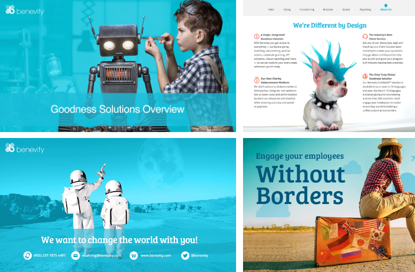
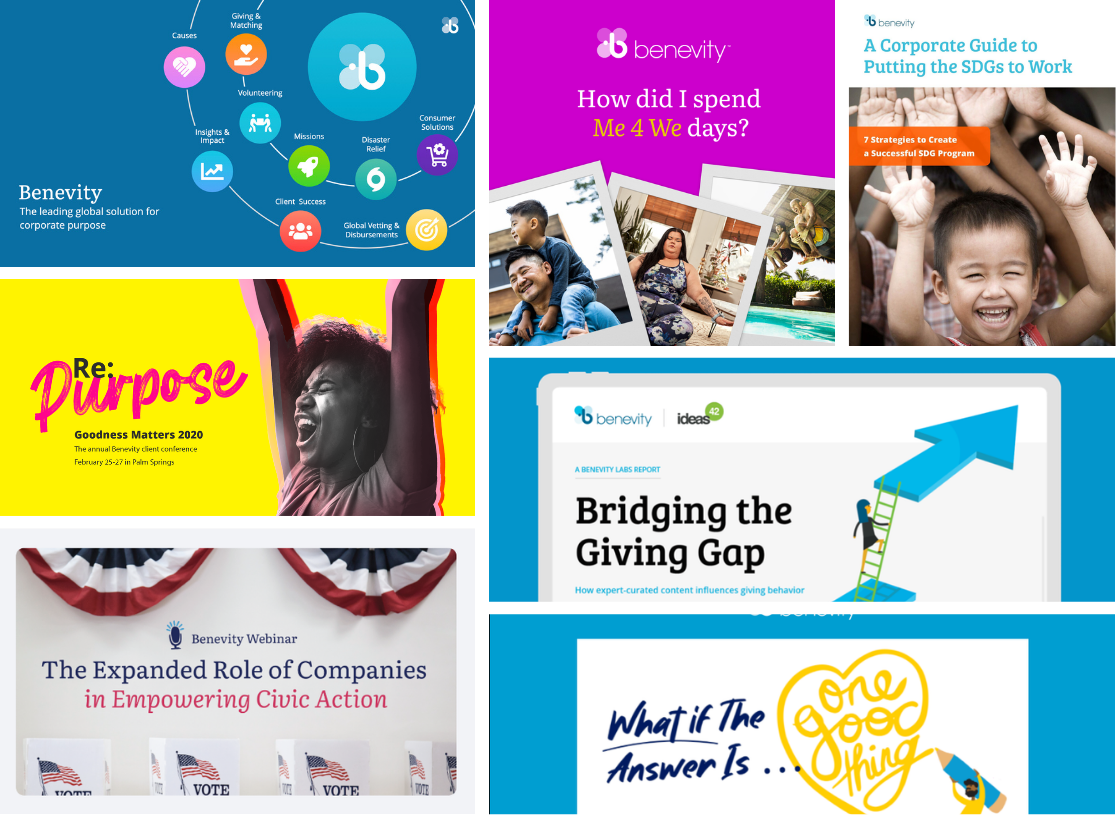
Collected work from across the organization—campaigns, product, presentations. Different teams, different intentions, different executions.
At first glance, it felt scattered.
But underneath, there were signals.
A tone. A rhythm. A point of view trying to hold itself together.
The work wasn’t to reinvent it.
It was to recognize it—and give it structure.
Building Something That Holds
The shift was subtle, but important.
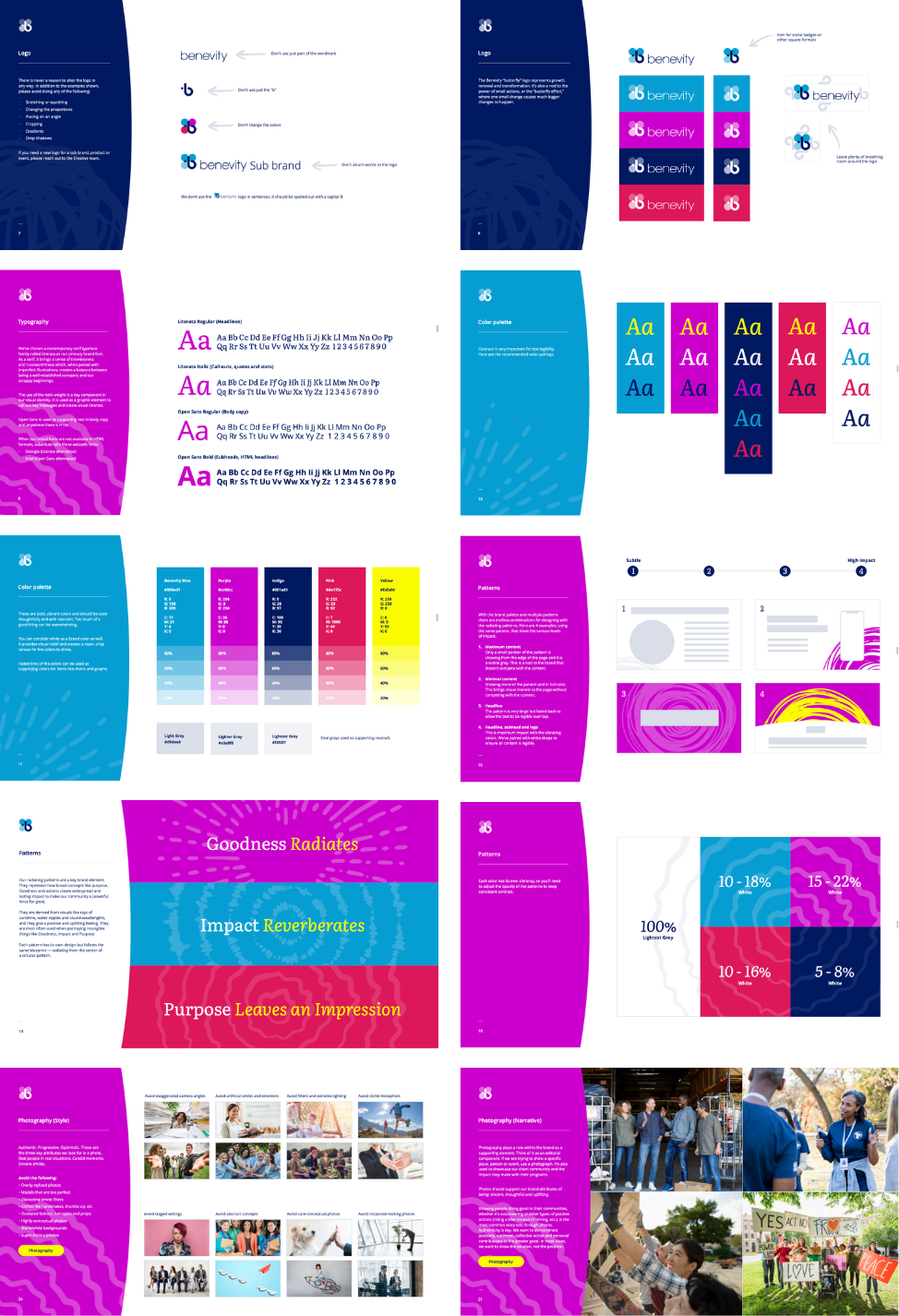
From assembling assets to shaping a system
From borrowed visuals to something more owned, more intentional
Not rigid, but consistent enough to carry meaning. Not decorative, but functional enough to scale.
A framework that could stretch without losing itself.
Unity Is the Name of the Game:
As the brand evolved, the goal wasn’t simply consistency—it was alignment.
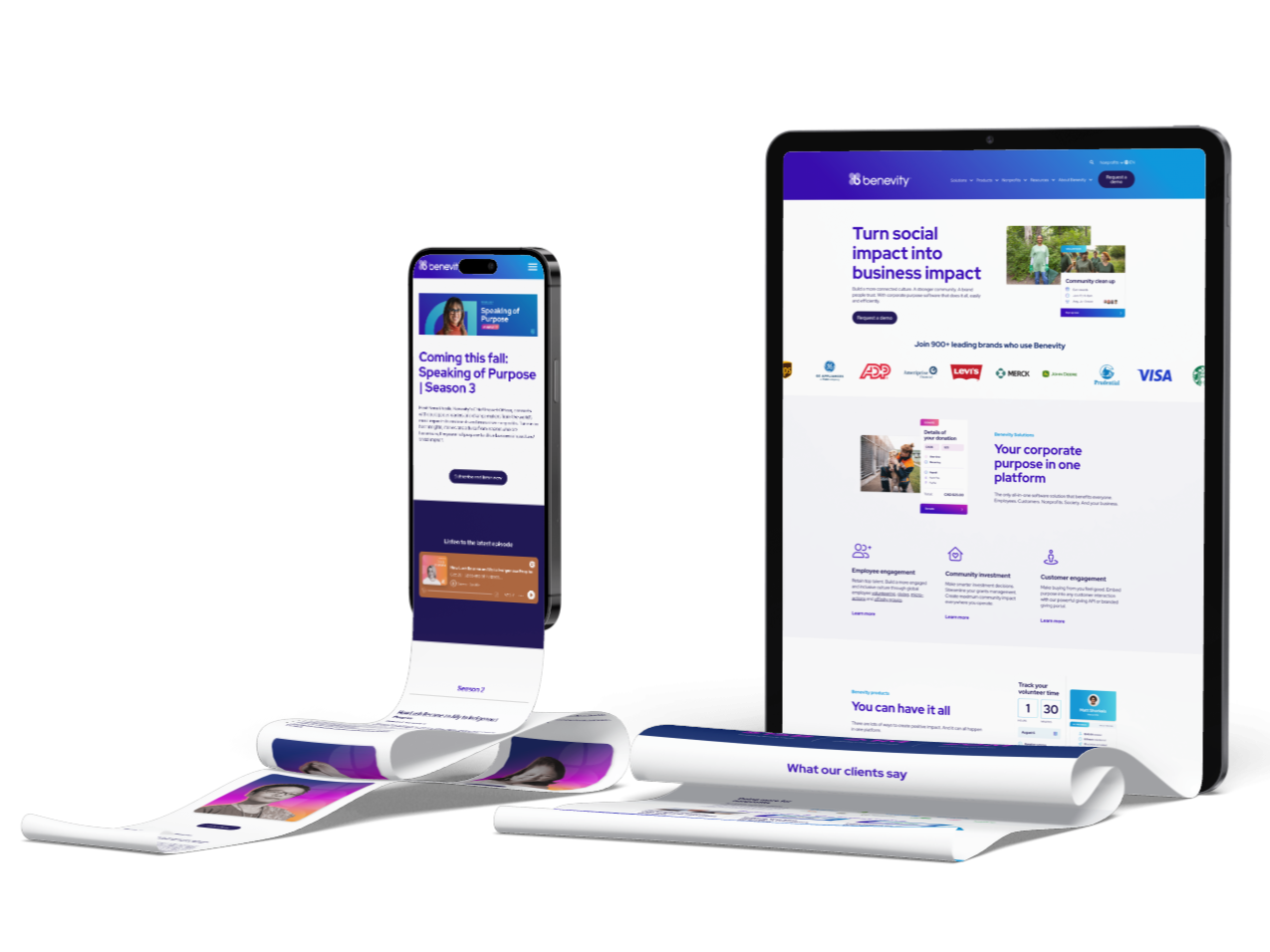
The experience inside the product and the experience outside of it needed to feel connected. Not identical, but clearly part of the same world.
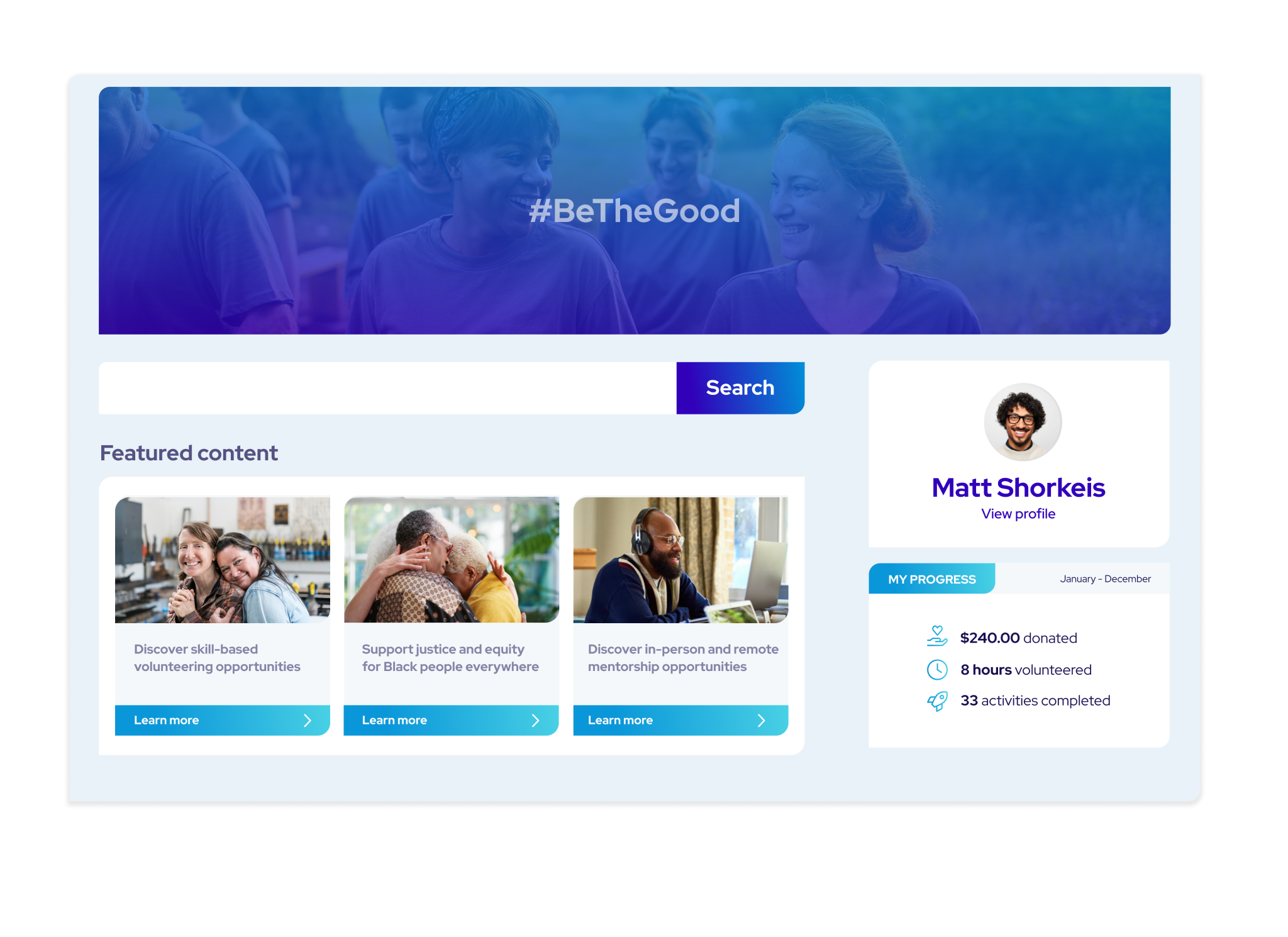
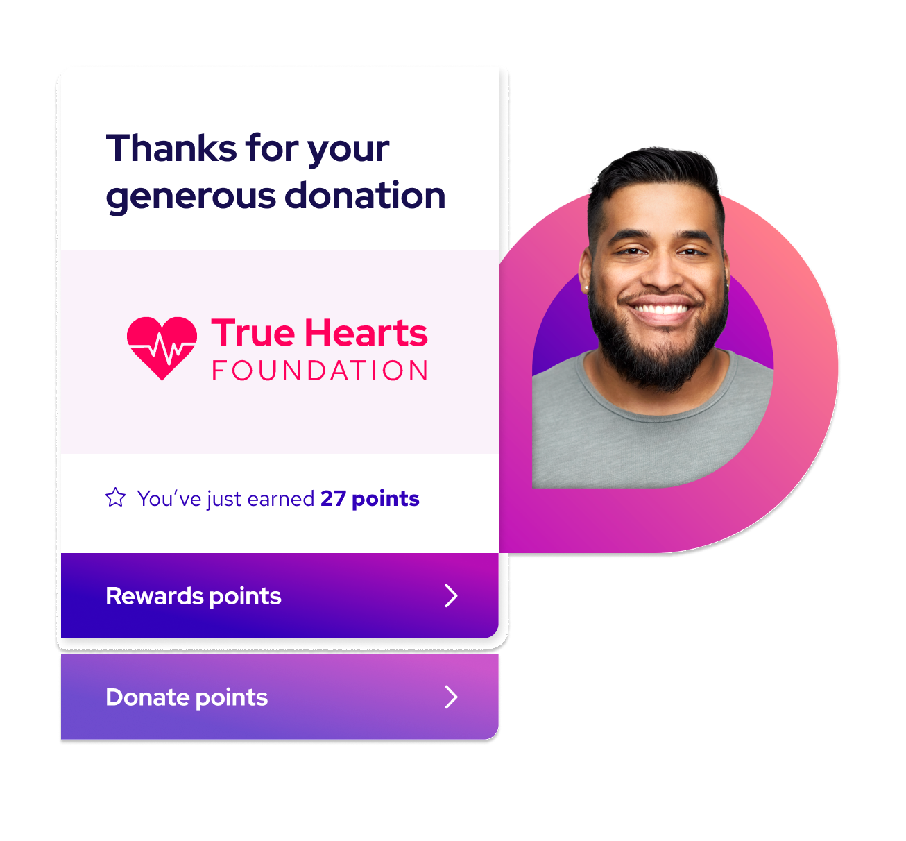
We worked toward a visual language that could move across product surfaces, campaigns, presentations, motion, and storytelling without losing coherence. Marketing became less performative. Product became more expressive. The distance between the two started to close.
From interface details to seasonal campaigns, the focus was always the same: create applications that feel intentional, recognizable, and human—without overexplaining themselves.
The result was a system flexible enough to evolve, but stable enough to remain unmistakably Benevity.




Simplifying the Complex:
Key Production Explanation Video
We took Benevity’s key features and translated them into a high-level, stylized animated video. The goal? Make complex concepts feel simple, engaging, and easy to understand. By combining clear visuals with a playful narrative style, we turned intricate ideas into a story that resonates, helping viewers quickly grasp what Benevity is all about.
Unique Yet Unified:
Campaign Consistency Done Right
How do you make a seasonal campaign stand out while keeping it true to the brand? We crafted creative assets that felt fresh and engaging but still tied seamlessly back to Benevity’s holistic branding. The result? A unique viewer journey that catches the eye while making sure it always feels like the same familiar voice is talking to you. It’s all about balance—distinct yet unmistakably Benevity.
